Back Versaleta Catalan Капитель (йоза) CE Kapitálky Czech Kapitæl (typografi) Danish Kapitälchen German Majuskleto Esperanto Versalita Spanish Kapiteeli (typografia) Finnish Petite capitale French Versaleta Galician


In typography, small caps (short for "small capitals") are characters typeset with glyphs that resemble uppercase letters (capitals) but reduced in height and weight close to the surrounding lowercase letters or text figures.[1] This is technically not a case-transformation, but a substitution of glyphs, although the effect is often approximated by case-transformation and scaling. Small caps are used in running text as a form of emphasis that is less dominant than all uppercase text, and as a method of emphasis or distinctiveness for text alongside or instead of italics, or when boldface is inappropriate. For example, the text "Text in small caps" appears as Text in small caps in small caps. Small caps can be used to draw attention to the opening phrase or line of a new section of text, or to provide an additional style in a dictionary entry where many parts must be typographically differentiated.
Well-designed small capitals are not simply scaled-down versions of normal capitals; they normally retain the same stroke weight as other letters and have a wider aspect ratio for readability.
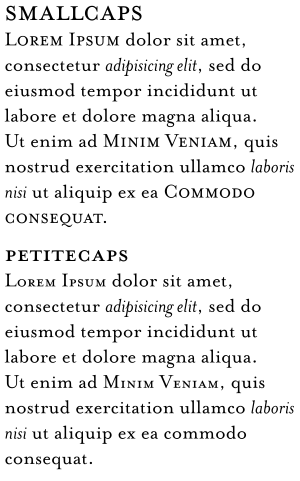
Typically, the height of a small capital glyph will be one ex, the same height as most lowercase characters in the font. In fonts with relatively low x-height, however, small caps may be somewhat larger than this. For example, in some Tiro Typeworks fonts, small caps glyphs are 30% larger than x-height, and 70% the height of full capitals. To differentiate between these two alternatives, the x-height form is sometimes called petite caps,[2] preserving the name "small caps" for the larger variant. OpenType fonts can define both forms via the "small caps" and the "petite caps" features. When the support for the petite caps feature is absent from a desktop-publishing program, x-height small caps are often substituted.
Many word processors and text-formatting systems include an option to format text in caps and small caps, which leaves uppercase letters as they are, but converts lowercase letters to small caps. How this is implemented depends on the typesetting system; some can use true small caps glyphs that are included in modern professional typefaces (font families); but less complex computer fonts do not have small-caps glyphs, so the typesetting system simply reduces the uppercase letters by a fraction (often 1.5 to 2 points less than the base scale). However, this will make the characters look somewhat out of proportion. A work-around to simulate real small capitals is to use a one-level bolder version of the small caps generated by such systems, to match well with the normal weights of capitals and lowercase, especially when such small caps are extended about 5% or letter-spaced a half point or a point.
- ^ Smith, Margaret M. "The Pre-history of 'Small caps': from all caps to smaller capitals to small caps". Journal of the Printing Historical Society. 22 (79–106).
- ^ "OpenType Layout tag registry". Microsoft. 2008-11-19. Retrieved 2014-05-15.